

UX Debt Detector
A web application that scores a product's UX debt and hands back a prioritized, dollar-weighted fix list in under ten seconds, built to replace the slow, subjective, expensive audit most teams either skip or outsource.
01 / The problem
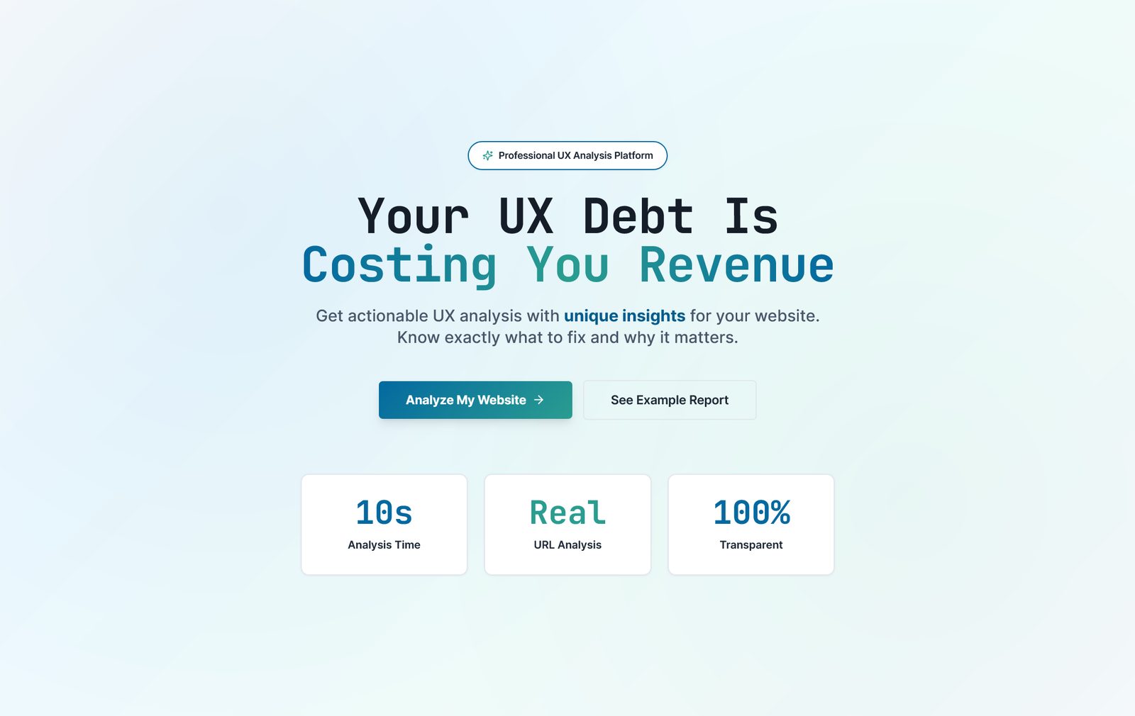
ux-debt-detector-quwt.vercel.app
A UX audit is supposed to be the thing that catches expensive mistakes before they ship. In practice it rarely works that way. A proper manual audit takes weeks, which means the team has usually already built on top of the problem by the time the report lands. The findings depend heavily on which consultant you hired and what they happened to notice that week, so two audits of the same product can disagree with each other. And the output is almost always a long document full of "nice to haves" with no ranking, so a founder reads it once, nods, and files it away.
The real cost isn't the audit fee. It's that nobody can put a number on what bad UX is actually doing to conversion, so it never wins the argument against a new feature.
The pattern I kept seeing: teams miss critical usability problems until after launch, spend effort on low-impact polish because nothing tells them otherwise, and have no shared language to even discuss UX health with a non-designer stakeholder. Poor UX quietly drives churn and support costs the whole time, and almost nobody is tracking it as a number that moves.
02 / The thinking
The guiding idea was blunt: make UX evaluation as fast, objective, and routine as running a linter on code, so a team can check their work without waiting on a consultant's calendar. That meant every design decision got tested against four principles: speed first, since value has to land in seconds, not days; objectivity, using measurable criteria to cut down on personal bias; clarity, so the output speaks to a business stakeholder as easily as a designer; and actionability, meaning every single finding ships with a concrete next step, not just a diagnosis.
I rejected building a subjective checklist tool that just restates Nielsen's heuristics with a checkbox next to each one. That's what most audit templates already are, and it's exactly the "opinion, not evidence" problem I was trying to remove. Instead, every issue gets scored on two independent axes, severity (critical, major, minor) and effort (low, medium, high), and those combine into a single weighted UX Debt Score a team can track over time the same way they'd track technical debt in a codebase.
I also decided early that this had to be monetization-ready from day one, not an eventual concern bolted on later. That single decision changed how the architecture was structured: clean separation between the analysis engine and the presentation layer, so authentication, storage, and billing could be added without a rewrite.
How it works, and who it's for
Submit
A URL or a design file goes in. No account required to get a first result.
Analyze
A rules-based engine combined with heuristic evaluation patterns checks navigation, clarity, feedback, consistency, accessibility, and performance.
Score
A severity-weighted scorecard comes back in under ten seconds, prioritized, not just listed.
Export
A one-page executive summary for stakeholders, plus a detailed technical appendix for the people who'll actually fix it.
Product managers
Get a stakeholder-ready report without commissioning a consultant.
Designers & developers
Get specific, implementable recommendations instead of vague critique.
03 / The business and the users
Priced across three tiers aimed at three different buying moments rather than one generic audit for everyone. A founder who wants a fast gut-check before a pitch reaches for the quick scan. A team preparing an actual redesign needs the deep audit, which comes with Figma-ready mockups attached to the findings, not just a description of what to change. And a startup heading into investor due diligence needs the pre-funding assessment, because "we've had our UX independently reviewed" is a real answer to give a VC's product partner.
$147Quick scanFast gut-check, core findings, no mockups
$797Deep auditFull scorecard plus Figma-ready fix mockups
$2,497Pre-funding assessmentDue-diligence-grade report for investor conversations
The target market is SMEs and startups with no in-house UX headcount, digital agencies that need fast, repeatable audits across many clients, and larger teams that want a consistent evaluation standard across several products at once. None of them are well served by hiring a $15,000 consultancy for something that should take minutes to get a first read on.
04 / The constraints
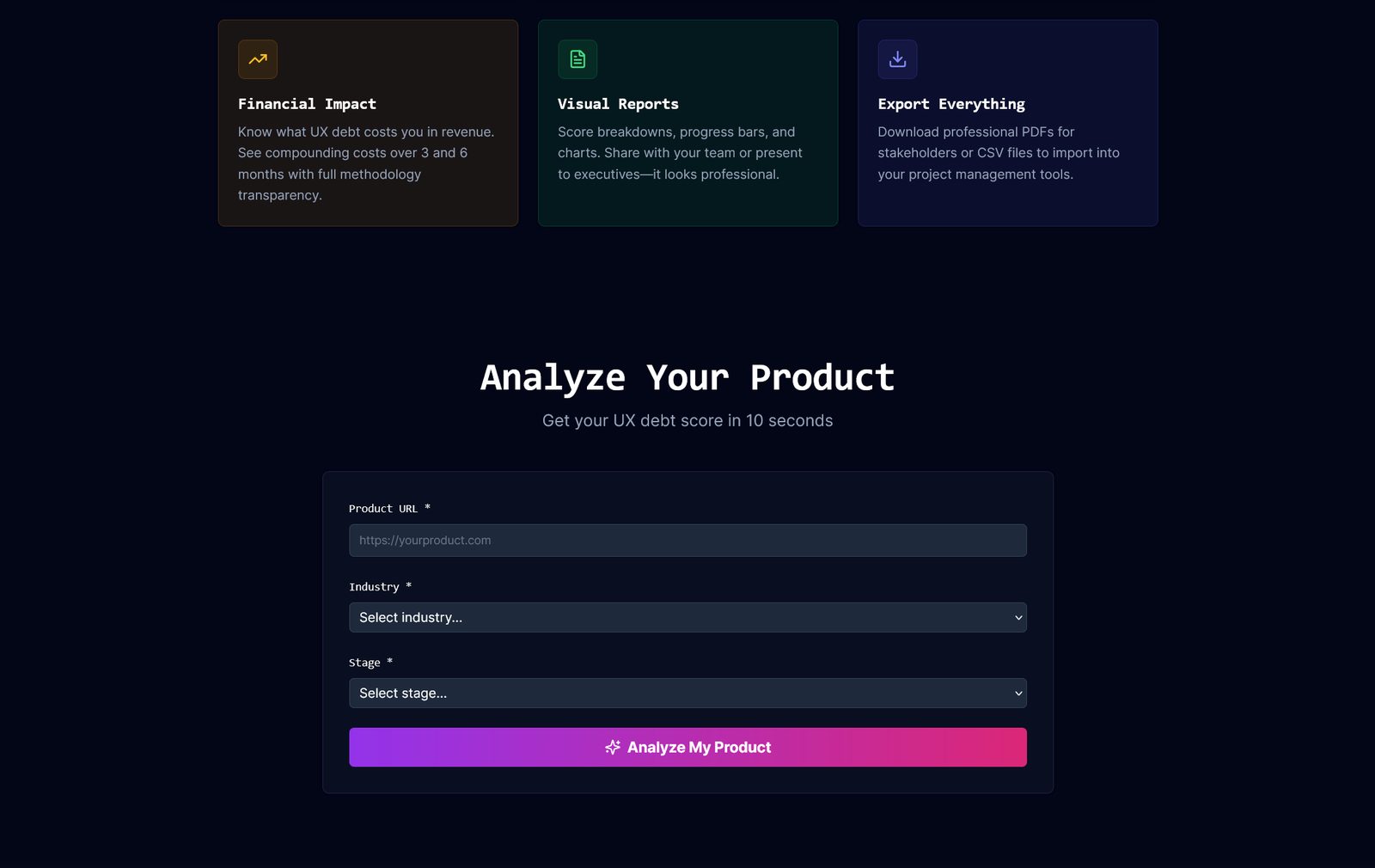
ux-debt-detector-quwt.vercel.app/analyze
Built entirely with HTML, CSS, and JavaScript, no heavy framework, which keeps the bundle light and the tool fast on the exact kind of underpowered connection a real audit target might be running on. The backend runs as serverless functions rather than a persistent server, and there's deliberately no database at launch: sessions are ephemeral, which keeps infrastructure cost close to zero and sidesteps a whole category of data-handling risk before the product has proven it needs to store anything long-term.
Output had to be usable by an engineering team immediately, not just readable by a designer, which is why every finding is formatted as a specific, implementable fix rather than a narrative paragraph. All inputs are sanitized, no personal data is stored, and HTTPS is enforced throughout, since a tool that audits other people's products has to hold itself to the standard it's checking for.
05 / The outcome
Live, production-ready, and monetization-ready from a six-week build. Early users reported coming back to it weekly to validate design decisions before shipping them, which is the exact behavior the "linting for UX" framing was aiming for. The architecture separating analysis from presentation means user accounts, Figma and Jira integrations, and industry benchmarking can all be added later without redoing the core.
The clearest thing this project proved to me: product teams don't need more opinions, they need a structured, objective framework that makes the next step obvious. Speed and clarity turned out to be features in their own right, not trade-offs against depth.
<10stime to a full scorecard
6 weeksconcept to live deployment
3independent pricing tiers
Solodesign and engineering