
PoseCraft
A crafted identity for a Calgary photography props maker, built typography-first so it could survive engraving into wood, embroidery on apparel, and a packaging seal the size of a coin, without turning into a generic woodworking logo.
PoseCraft makes handcrafted photography props out of Calgary, posing cubes, apple boxes, studio pedestals, custom studio pieces, cut, sanded, and finished by hand, then shipped to working photographers across Canada. That puts the brand between two worlds that don't usually sit comfortably together: real craftsmanship, wood grain, tool marks, physical imperfection, and creative professionalism, the visual sensibility of people who care about composition and studio presentation for a living. An identity that leaned too far into "handmade" would read as a woodworking shop. One that leaned too far into trendy photography-brand aesthetics would date within two years and say nothing true about how the product is actually made.
The real test wasn't whether the logo looked good on a screen. It was whether it survived being engraved into a posing cube, embroidered onto a cap, and shrunk to a packaging seal the size of a coin, without falling apart.
Early exploration went toward a signature-style, handwritten mark in warm burnt-orange and bronze, which communicated personality and handmade character convincingly on its own. I rejected carrying that forward as the primary identity, because a script signature has almost no versatility across the physical range PoseCraft actually needs: it doesn't engrave cleanly, doesn't embroider at small sizes, and doesn't hold up as a packaging seal. Personality that only works in one format isn't a system, it's a single asset.
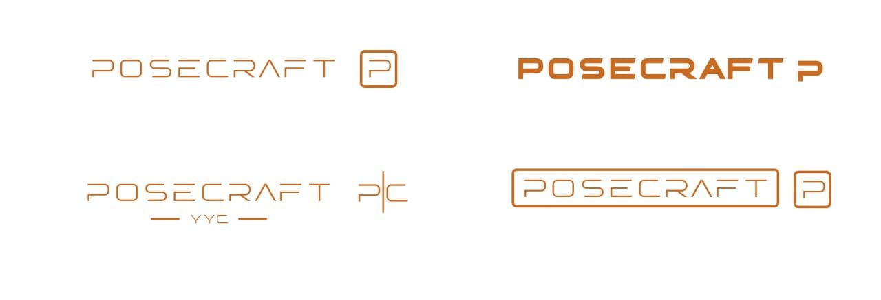
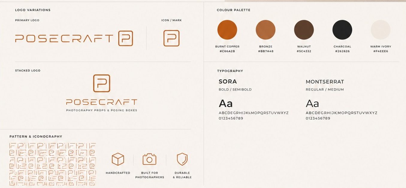
The strategic shift was reduction rather than addition. Instead of layering in more symbols tied to photography, woodworking, or Calgary, the identity became increasingly typographic: a geometric wordmark built from controlled, consistent letterforms, with strategic horizontal cuts that give it rhythm, and a custom angular A that references structure and physical making without drawing a literal tool. Paired with it is a compact P mark, enclosed in a softened rectangular frame, built specifically for the situations the wordmark can't reach, stamps, small labels, engraving, social avatars, embroidery.
The palette follows the same logic as the mark: it isn't decorative, it's sourced from the actual physical world of the product. Burnt orange for warmth and craft, bronze for premium print finishing, walnut tying directly to the wood itself, charcoal for contrast and sophistication, and ivory instead of stark white to keep warmth in the system rather than clinical brightness.
Recommended balance: 60% ivory and neutral, 20% walnut and charcoal, 15% burnt orange, 5% bronze and specialty finishes.
The primary audience is working photographers, portrait, newborn, family, studio, and commercial, people who evaluate visual quality for a living and will notice immediately if a props brand's own identity doesn't hold up to the standard they'd apply to their own studio. The secondary audience is the studios and creative spaces that buy in volume. Neither audience wanted a "creative" logo in the trend sense. They wanted something that read as specialist creative equipment, closer to a premium furniture or industrial-design brand than a typical small-batch craft seller.
That's the actual positioning shift this project made: not a woodworking company that also serves photographers, but a specialist creative-equipment brand that happens to build in wood. The distinction changes how every other decision, packaging, photography direction, digital tone, gets made downstream.
Every physical application was treated as a design constraint from the start, not a problem to solve after the fact. The logo had to stay legible engraved into wood, printed on cardboard, embroidered on apparel, applied to small packaging labels, used digitally, and reduced to a social media avatar, six very different reproduction methods with six different failure modes for fine detail. That's exactly why the identity leans on open letterforms and a separate compact mark rather than one dense composition trying to do everything at every size.
Where the mark actually lives:
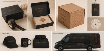
This is a recent identity, so I won't invent performance numbers it hasn't had time to earn. What I can say plainly: the client moved the identity from presentation concept into actual product use, applying the mark to real posing boxes and cubes rather than leaving it as a deck nobody acted on. That's the outcome that matters most for a physical-product brand, and it's the one I look for before I call any identity project finished.
The lesson that traveled with me from this project: the strongest direction wasn't the one with the most visual ideas, it was the one that could carry the brand across the widest range of physical contexts without losing its character. Designing for engraving and embroidery from day one, rather than adapting a screen-first logo afterward, produced a more useful system than starting from a beautiful static logo ever would have.