

Erco Grey Renovations
An Ontario renovation company's identity carried five different symbols trying to speak at once. The rebuild kept everything those symbols meant and said it with one house-based monogram instead.
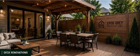
Erco Grey renovates garages, basements, decks, fences, and exteriors across Ontario, with a genuine interest in sustainable, responsible building woven into how the company operates. The existing mark tried to say all of that at once: a house, a hammer, a window, bricks, leaves, and a green gradient, layered into one illustration. Every element was individually relevant. Together, they produced too much information for a mark that has to work at business-card size and at roadside-sign size in the same week. It read as an illustration doing its best to become a corporate identity, rather than an identity built to survive the vehicle doors, work jackets, and site signage a construction brand actually lives on.
None of those original five ideas were wrong. A house reads as residential property and transformation. A hammer reads as construction and workmanship. Bricks read as structure and durability. A window reads as light and improved living. Leaves read as sustainability and renewal. The problem was never meaning, it was that five meanings were competing for attention in one small space, and a mark trying to say five things at a glance ends up saying none of them clearly.
The solution was symbolic reduction, not symbolic removal. The final mark folds a simplified house silhouette around an integrated E and G structure, so the company's own initials do double duty as the building's frame rather than sitting beside a generic house icon as a separate afterthought. A four-pane window supplies the remaining residential cue, and negative space does most of the remaining communication, which is exactly what makes the mark reproduce cleanly at every size a construction company actually needs, from a lawn sign down to a social avatar.
The sustainability story didn't disappear with the leaves, it matured. Rather than decorative green iconography, the brand idea became renewing spaces responsibly: extending the life of existing properties, choosing durable materials, and building things designed to last, which is a sturdier, more credible sustainability position for a construction company than a leaf icon ever communicated on its own.
A renovation client makes high-value decisions based on trust signals that show up long before any actual construction starts: the quote document, the site sign next door, the truck parked outside a neighbour's house. The color system was rebuilt around that reality. Instead of green everywhere, the palette narrows to forest green for recognition and meaning, paired with graphite, concrete grey, and warm white, so green reads as a deliberate brand signal rather than the entire visual identity saturating every surface.
Typography followed the same logic: a bold, condensed display face for the brand name itself, paired with a lighter, wider-tracked treatment for "Renovations" underneath it, so the hierarchy reads as an established contractor rather than a handyman flyer. Services were grouped into clear categories, interior renovation, exterior improvement, structures, outdoor living, rather than presented as an undifferentiated list, which makes the company look strategically organized rather than willing to take on anything.
Everything about this identity had to survive environments a typical logo review never considers: a garage door plaque, a laser-engraved deck marker, a large roadside project sign, construction hoarding, a pickup truck door, and a work jacket, all outdoors, all viewed briefly and often from a distance. That's the real argument for the reduction. A five-symbol illustration loses legibility fast at signage distance and vehicle-graphic scale; a single strong geometric mark built from negative space holds up at both extremes.
Photography direction was treated as part of the identity system rather than a separate marketing decision, deliberately favoring daylight, completed-project photography over staged nighttime luxury shots, because for a renovation company, believable daylight photography of a real finished garage or deck communicates trust more effectively than an aspirational image ever would.
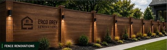
Delivered as a full system, not just a new logo file: corporate stationery, environmental and vehicle applications, and a digital direction built around project estimates and a real portfolio of completed work. As with any recent identity, I'm not going to invent adoption metrics it hasn't had time to generate. What I can say directly is what changed: a mark that struggled to reproduce at small sizes became one built specifically to survive a garage door, a work jacket, and a roadside sign, which is the actual job a construction company's identity has to do every day.
The lesson this project reinforced: simplifying an identity doesn't mean deleting meaning, it means finding the one structure strong enough to carry all of it at once. And for a brand that lives on vehicles, signage, and finished job sites far more than on a presentation slide, designing for those real environments has to happen before the logo is called finished, not after.