

Enocessity
A packaging-first brand identity system for a US skincare label built around one whipped body butter formula, perfected over more than a decade of daily use, entering a market where trust is the actual product being sold.
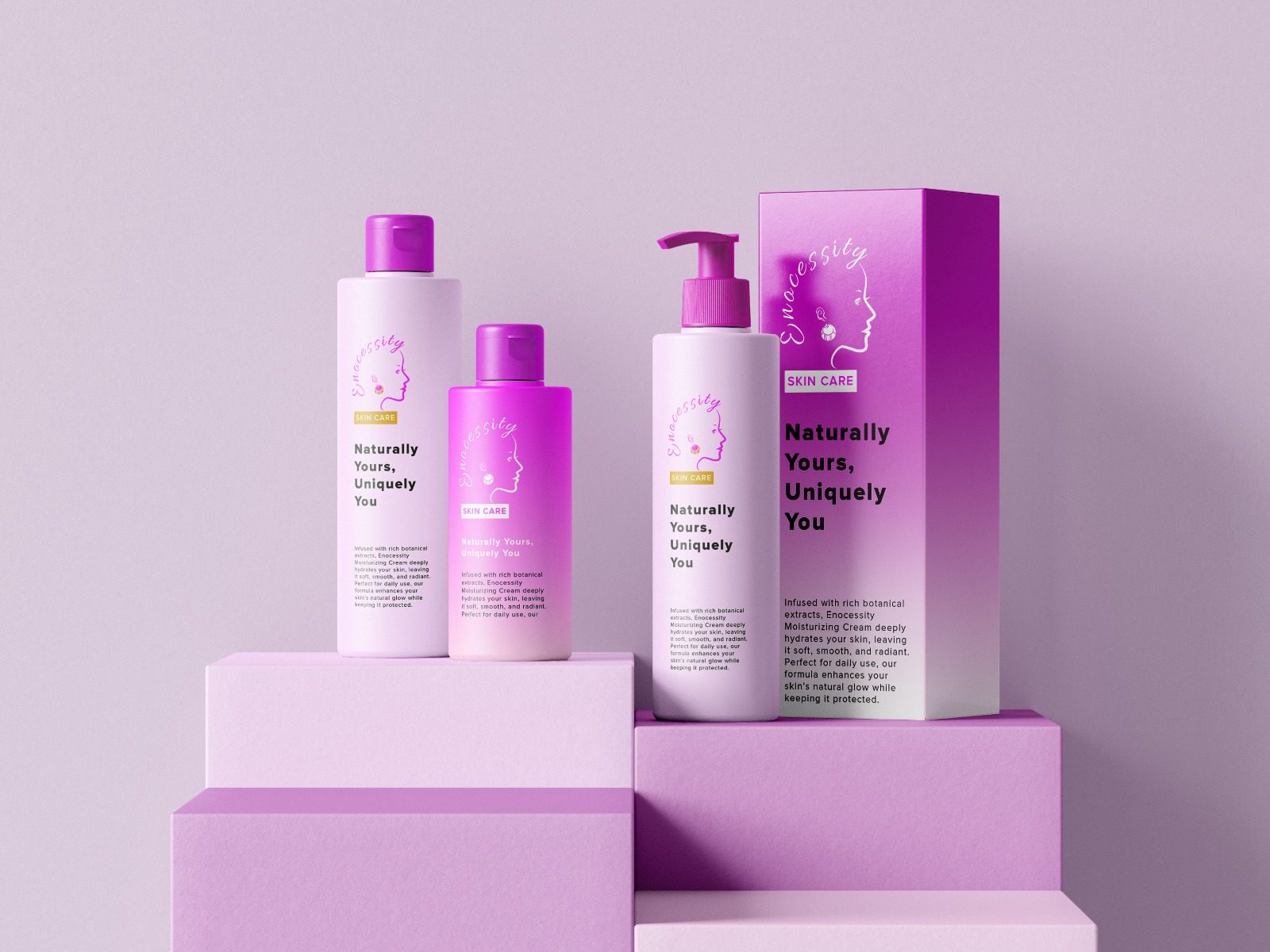
The US skincare market is oversaturated, with thousands of brands fighting for the same shelf space and the same feed impression. Most of them try to win that fight the same way: minimalist white packaging, a thin sans-serif logotype, and "clean beauty" language that customers have grown cynical about because they've seen it a hundred times before with nothing behind it. Standing out by shouting louder in that environment just adds to the noise. The actual opening was different: be the one thing on the shelf that looks like it can be trusted, in a category where trust is earned through clarity, not through another round of performative minimalism.
That challenge is sharper than it sounds because of where it has to be won: on packaging small enough that there's barely room for the legally required information, let alone a story. Whatever the brand was going to say about itself had to survive a two-inch label and still land.
"I left Nigeria for the States in my early twenties, carrying more than a suitcase. I was also carrying a skin secret. When I arrived in America, my skin went through a period of rebellion. The dry indoor heating, the harsh winters, the watery commercial lotions that promised hydration but delivered nothing, my skin felt dull, tight, and foreign in this new climate. Then I remembered I did come with a skin secret. I got to work. I called home, had my parents bring supplies when they visited, raided health food stores, and spent years perfecting this formula. That was over a decade ago. I've been using this exact butter on my skin ever since, morning and night."
— Enocessity founder, on the origin of the formulaThat story is the actual brand strategy, not a founder-bio paragraph tacked onto an About page. Enocessity refuses to use water in its formulas, because water requires harsh preservatives, and the brand uses vitamin E, one of nature's own stabilizers, instead. The butters are sourced unrefined from Lagos specifically so the vitamins and essential fatty acids stay intact rather than degrading in processing. Everything is mixed and whipped by eye and touch, not measured by machine, which means texture shifts slightly batch to batch, because real plant material doesn't behave like a lab-stabilized base, and the brand treats that as honest rather than as a flaw to engineer away.
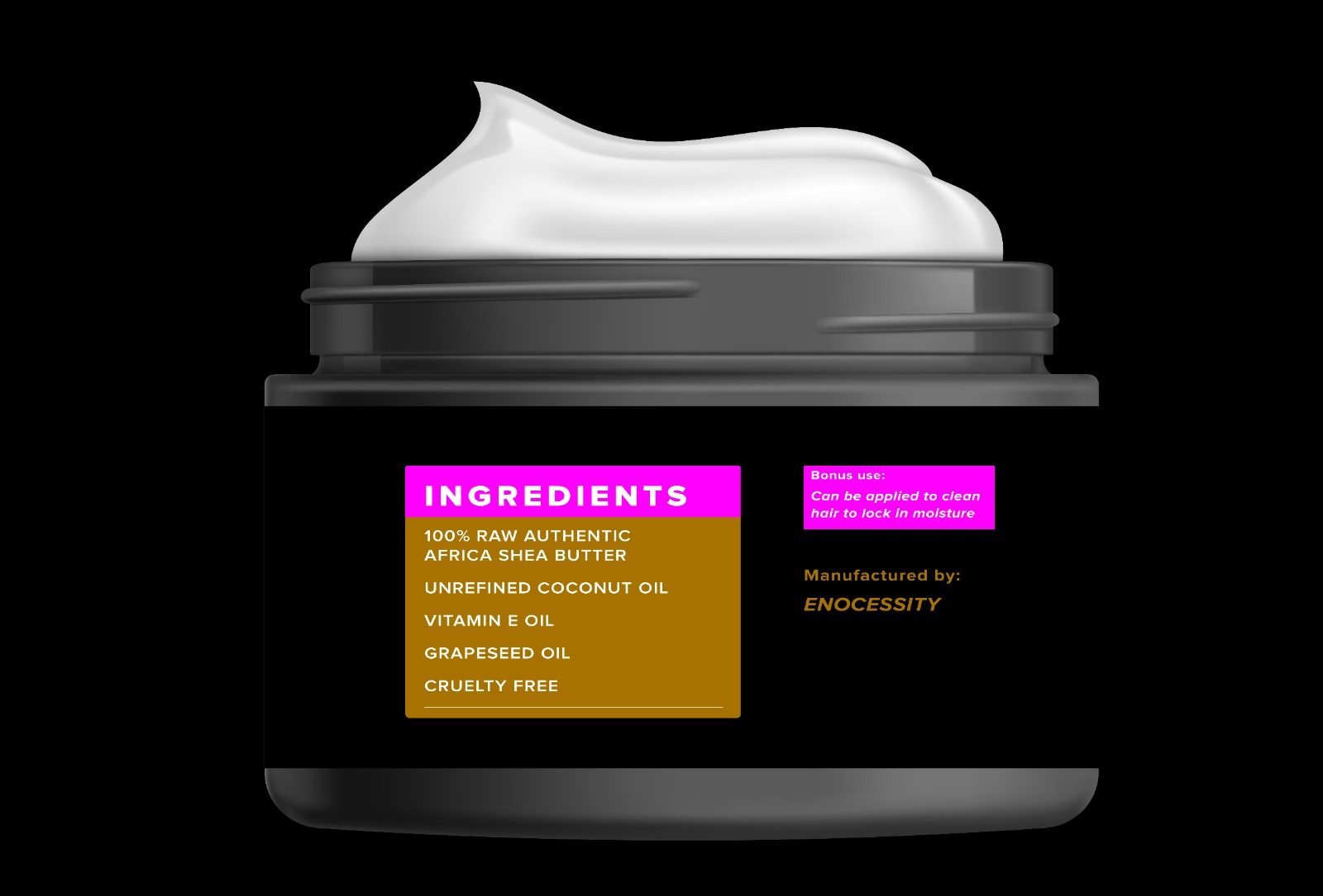
Structured research came first: US skincare market trends, competitive positioning, packaging and labelling compliance constraints, and what actually reads as trustworthy to a skincare-literate buyer versus what just reads as expensive. I rejected the safe route of all-white minimalism with a thin serif logotype, since that's precisely the shelf everyone else is already occupying, and being one more entrant in that look would have made the product invisible rather than distinct.
Instead the identity was built around confident, high-contrast color coding across the product range, so a customer scanning a shelf from a distance can tell the range apart before reading a single word on any label. Restraint was used deliberately, not as decoration but as a signal: clean typography and a controlled palette communicate safety, efficacy, and confidence more effectively than visual flourish does in a category where a customer's skin is genuinely on the line.
I treated this as a system to be built once and reused, not a set of one-off assets. Every typographic and spatial rule exists so new SKUs can be added later without a redesign, and so regulatory text can sit inside the design system without visually fighting the brand.
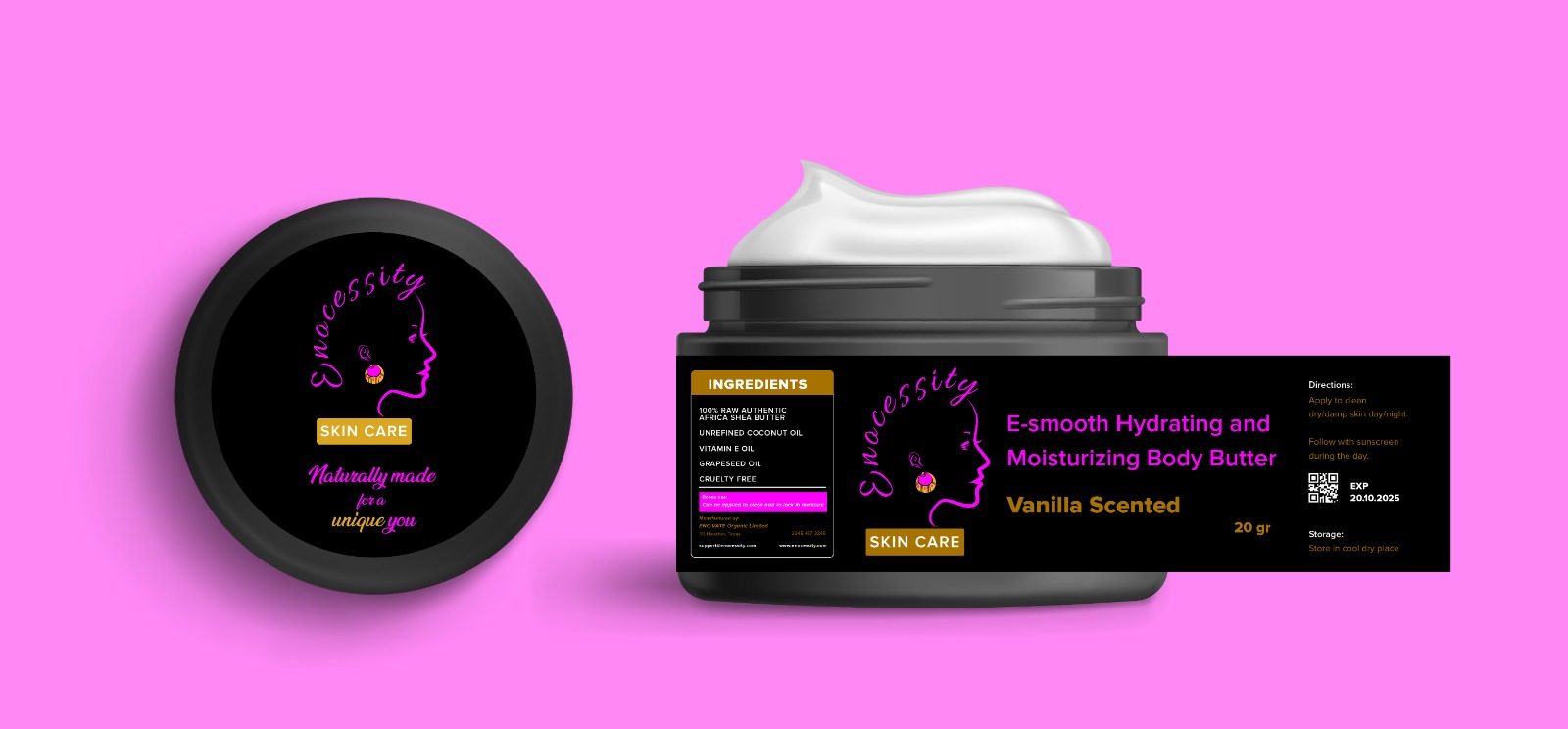
The client sells across multiple container types, tins, bottles, tubes, and jars, each with different print and die-line constraints, so the system had to be modular from the start: one wordmark, one type system, one controlled palette, applied consistently across materials that don't behave the same way under print. Every asset was built print-ready from the brand system stage rather than adapted afterward, because packaging that looks right in a flat mockup and then fails on an actual tin costs real money to fix after the fact.
The target buyer is a conscious skincare consumer who reads ingredient lists and has learned to distrust brands that lean entirely on the word "natural" without backing it up. For that buyer, the origin story isn't marketing flavor text, it's the actual evidence: a formula one person trusted enough to use on their own skin, including their feet, every single day for over a decade before ever selling a jar of it.
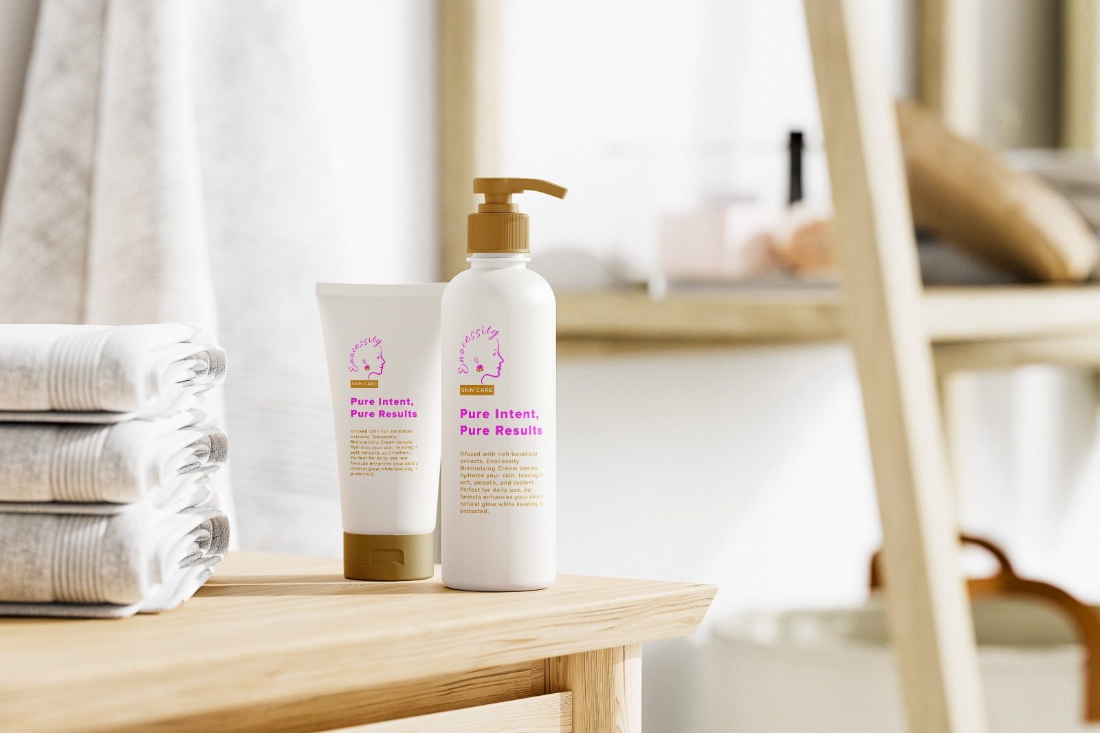
Brand identity and packaging are complete and production-ready across the full container range, built for North American retail and digital distribution. A full website and e-commerce rebuild is the next phase, currently in scope. The most sophisticated part of this system is the part that's easiest to miss: in a category built on visual noise, the most distinctive choice available was restraint, because consumers scanning a shelf don't need more signals competing for attention, they need one clear one.